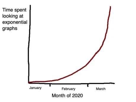
In the past weeks, I have seen flourishing a lot of COVID analysis. Some are very simple and just nicely display the data with a shallow analysis. Some adopt a different angle and propose a new approach to the data. The most advanced ones feature maps or crazy modelizations of the disease spread.
Why so many analysis and why now?
My best guess is that this disease is fearful. People get anxious, and they want to act doing what they know how to do best. In the case of data scientists, they compulsively process and analyze data. In this maelstrom of graphs, I have seen a lot of interpretation overfitting. In particular, people trying to see patterns in what looked like noise to me.
Country death count alignment
In particular, I have seen a lot of graphs comparing the number of deaths in the different countries, trying to find out where the disease spreads the fastest, which country is acting best against the disease. However, the criterion used to align the curves is arbitrary and has a significant impact on the comparison between death counts.
In the following graphs, I use a logarithmic scale for the best visibility. I only report results in Europe for the sake of simplicity. My goal is to highlight how changing the line matching criterion impacts the ranking of countries. For this purpose, I have set the France curve fixed so that one can easily compare the rank of other countries to it.
Using a fixed threshold of deaths
The most common criterion is to set a fixed number of deaths, most of the time 100, and align all curves on this landmark.
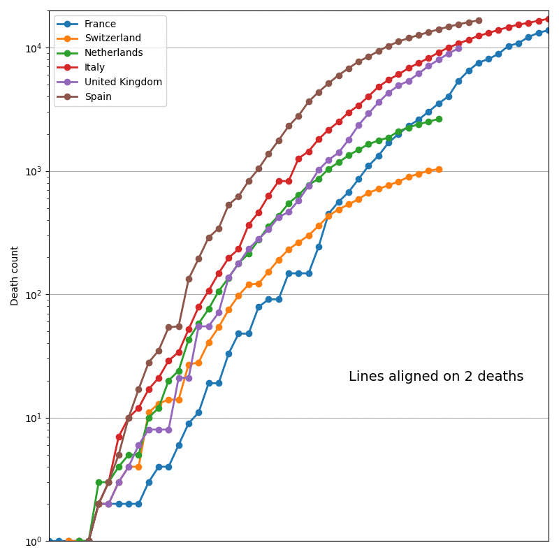
On this graph, the results are striking. Because of the small plateaus at the beginning of the French epidemic, France seems to be less impacted by COVID with a low threshold and aligned with others with a higher one.
Using a ratio of the country population
Another threshold I have seen is depending on the number of death per million inhabitants.
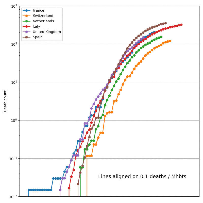
This one is more stable. Switzerland and the Netherlands are still less impacted, but there is no way to differentiate the other countries.
Conclusion
In the end, the evolution seems very similar across countries, and the interpretation of these curves highly depends on external factors such as the number of epidemic clusters. We must also take into account the hospital capacities that can significantly increase the death rate. This is why epidemiology has its models, such as compartmental ones. In the end, I think that:
- Most of the analyses I have read do not bring information and are more likely to add confusion to a situation tough to analyze.
- We should always be critical about our analyses and never forget that even if data comes for ground measurements, it can be noisy, biased, or incomplete.
The scripts I used to generate these figures are available here and there.